today was an extremely productive day [i love it when i have these] in terms of our thesis paper. since the beginning of this project- we have been knee deep in the design process due to time restraints and deadlines. so needless to say- we have some what neglected our thesis paper because we have been working completely backward compared to a typical design thesis project. to help jump start our writing engines again- matt and i met with patrick [another professor in our department] today and brainstormed for over an hour a solid thesis statement that each of us can focus on throughout our papers.
we then set a schedule for ourselves [another thing that made me feel productive] for the coming month so we can pace ourselves and make sure we accomplish not only our thesis paper but our design of the store as well.
Tuesday, June 30, 2009
Monday, June 29, 2009
we need sage to spice things up a bit
This afternoon Debbie and I meet with local artist Sage Hanna at the Green Bean to discuss her possible involvement in our project with The Salvation Army. We first came across Sage's work during our visit with Scott Richardson at Revolution Mills. She painted a large wall mural as well as several hanging canvases at ENVY salon in the mill.

After we all ordered a drink, Sage began to tell us a story of her education and where she is today with her artwork that was quite varied across disciplines and media. After explaining the project and filling her in on what we are looking for she was eager to join. Sage will be working on several ideas and hopefully within two weeks time have a color palette as well as an estimate for us to review with the board.

After we all ordered a drink, Sage began to tell us a story of her education and where she is today with her artwork that was quite varied across disciplines and media. After explaining the project and filling her in on what we are looking for she was eager to join. Sage will be working on several ideas and hopefully within two weeks time have a color palette as well as an estimate for us to review with the board.
Friday, June 19, 2009
round TWO...
TODAY we had our second design meeting with the new store committee of salvation army. we presented to them our more finalized design for the store along with details regarding the wall and mid floor fixtures. we emphasized the importance of details because they will set this store apart from the current salvation army family stores.
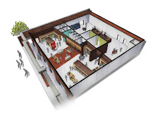
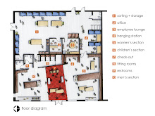
 our final plan diagram breaks down all the spaces that have been incorporated into the design. since we have moved forward with scheme 2- we have designed the store by placing the entire sales floor towards the front of the store and the donation center and storage will be placed in the back of the store. this creates a fluid and accessible circulation plan and also emphasizes the importance of the merchandise.
 within our store layout- we have broken up the apparel sections into men, women's, and children. the fixtures that will hold the clothes and accessories will be placed along the walls and continue into the middle of the sales floor to delineate space. we have also proposed a drop down ceiling above the circulation pathway from the store's entrance to the cash wrap to emphasize it as a main focal point witin the store. the drop down ceiling will create a transition for the customers to experiecnce once they enter and travel throughout the store. the ceiling will have can recessed lights to illuminate aid in wayfinding but will also have track lights beside it to illuminate the jewelry cases placed beneath it. there are also two area within the women's and men's section to act as a flex display space for multiple pieces of merchandise to be displayed for shorter periods of time. this flex concept will allow for the merchandise to be exchanged out quickly as they store fluxuates with volume of merchandise.
 a custom built mid-floor fixture is going to be placed within the men's section of the store to create an addtional display unit for clothing and accessories. the unit will have a clothing rack as well as a shelf above the rack for merchandise but there will also be a table that will extend from the unit to create another focal display for specific merchandise. the fixture will be covered in slats of wood that will extend and then cut off to create the shape of the salvation army sheild [note the black and white line drawing above].
 the wall fixtures will also case the merchandise similarly to the mid-floor fixture but will have a smaller application of wood onto its face. track lighting will be placed above the fixture to illuminate the products within the case. we have thought of incorporating color into the space by painting the backdrop to the inside of the cases different colors to allow the merchadise to stqand out.
 we presented to the board members at the presentation a WISH LIST for the project-- materials and serives that we are searching for either donations or reduced prices. that way we can save money and be able to put it towards other details in the project.
salvation army were pleased with the design and approved for it to move onto the next phase. so as of now we are on a waiting platform until we hear back from our contractor in regards to the cost estimation from the design. once we have a better idea of how much everything will cost- we then can proceed with more details of the interior and START CONSTRUCTION!
 our final plan diagram breaks down all the spaces that have been incorporated into the design. since we have moved forward with scheme 2- we have designed the store by placing the entire sales floor towards the front of the store and the donation center and storage will be placed in the back of the store. this creates a fluid and accessible circulation plan and also emphasizes the importance of the merchandise.
  within our store layout- we have broken up the apparel sections into men, women's, and children. the fixtures that will hold the clothes and accessories will be placed along the walls and continue into the middle of the sales floor to delineate space. we have also proposed a drop down ceiling above the circulation pathway from the store's entrance to the cash wrap to emphasize it as a main focal point witin the store. the drop down ceiling will create a transition for the customers to experiecnce once they enter and travel throughout the store. the ceiling will have can recessed lights to illuminate aid in wayfinding but will also have track lights beside it to illuminate the jewelry cases placed beneath it. there are also two area within the women's and men's section to act as a flex display space for multiple pieces of merchandise to be displayed for shorter periods of time. this flex concept will allow for the merchandise to be exchanged out quickly as they store fluxuates with volume of merchandise.
  a custom built mid-floor fixture is going to be placed within the men's section of the store to create an addtional display unit for clothing and accessories. the unit will have a clothing rack as well as a shelf above the rack for merchandise but there will also be a table that will extend from the unit to create another focal display for specific merchandise. the fixture will be covered in slats of wood that will extend and then cut off to create the shape of the salvation army sheild [note the black and white line drawing above].
  the wall fixtures will also case the merchandise similarly to the mid-floor fixture but will have a smaller application of wood onto its face. track lighting will be placed above the fixture to illuminate the products within the case. we have thought of incorporating color into the space by painting the backdrop to the inside of the cases different colors to allow the merchadise to stqand out.
 we presented to the board members at the presentation a WISH LIST for the project-- materials and serives that we are searching for either donations or reduced prices. that way we can save money and be able to put it towards other details in the project.
salvation army were pleased with the design and approved for it to move onto the next phase. so as of now we are on a waiting platform until we hear back from our contractor in regards to the cost estimation from the design. once we have a better idea of how much everything will cost- we then can proceed with more details of the interior and START CONSTRUCTION!
Tuesday, June 16, 2009
coffee with bob
This morning Debbie and I got out the umbrellas to make it to our meeting with Bob Isner, our contractor for this project. We wanted to meet with Bob to discuss some of our working drawings as well as details for the retail space. With Debbie and I being new to this whole situation we wanted to make sure that when the time comes to turn in our drawings to Bob that they will be complete and easily understood. He reviewed our work and made suggestions that we all feel will help this project transition smoothly into the construction phase.
Bob also wanted to have a conversation with us about the project and our involvement. He was interested to know how we had decided to participate in this project with The Salvation Army. He seemed impressed with our work thus far and stated he would be more than welcome to help with any questions and concerns that may arise along the way. Debbie and I both feel very fortunate to have someone like Bob on our side. Thanks.
Bob also wanted to have a conversation with us about the project and our involvement. He was interested to know how we had decided to participate in this project with The Salvation Army. He seemed impressed with our work thus far and stated he would be more than welcome to help with any questions and concerns that may arise along the way. Debbie and I both feel very fortunate to have someone like Bob on our side. Thanks.
Monday, June 15, 2009
let's get some shoes...
today matt and i decided to take a little field trip to four seasons mall to do a little sketching and exploring. we had a few stores in mind that we knew expressed some good design qualities like pacsun, express, and forever 21 and spent a some time taking notes and analyzing the space. we took note on the store fixtures, materials, floor plan, lighting, and visual merchandising. below are the notes and sketches we did during our outing....


Wednesday, June 10, 2009
we have the green light...
we met yesterday with both the contractor and the leasing agent of the property- and i don't think it could have gone any smoother. they both approved our proposed design [with some minor changes] and believe that it is a more successful design and will even make the fire marshal happier :)
matt and i will be finalizing the floor plan this week to drop it off at the contractor's office so he can draft it up and pass the design for approval of the city. he will also total up the cost of the changes that will be made to make sure that we are staying as close to budget as we can. we then can expect construction to start during the beginning of july and continue for about 6-8 weeks.
during the next week we will be focusing on finalizing some interior details such as fixtures, materials, lighting, and graphics. this will all be in preparation for our next design review on friday- june 19th at 8am. this will be the final time that we will be presenting the whole design to the store committee for approval.
everyday gets more and more exciting because we are starting to see the light at the end of the tunnel...
now about that concept and thesis paper??.......more to come!
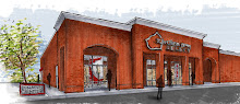
 front facade
 group meeting with the contractor and leasing agent


 future donation drop off area + parking lot beside store
 existing handicap ramp that will be used for transportation of large donation pieces into out of of donation center
 road side signage
matt and i will be finalizing the floor plan this week to drop it off at the contractor's office so he can draft it up and pass the design for approval of the city. he will also total up the cost of the changes that will be made to make sure that we are staying as close to budget as we can. we then can expect construction to start during the beginning of july and continue for about 6-8 weeks.
during the next week we will be focusing on finalizing some interior details such as fixtures, materials, lighting, and graphics. this will all be in preparation for our next design review on friday- june 19th at 8am. this will be the final time that we will be presenting the whole design to the store committee for approval.
everyday gets more and more exciting because we are starting to see the light at the end of the tunnel...
now about that concept and thesis paper??.......more to come!
 front facade
 group meeting with the contractor and leasing agent


 future donation drop off area + parking lot beside store
 existing handicap ramp that will be used for transportation of large donation pieces into out of of donation center
 road side signage
Tuesday, June 9, 2009
i don't think we are in deep yogurt anymore...
PRESENTATION:
on friday- june 5th we had our first design review with salvation army's new store committee to present our initial design ideas for the retail store/ donation center. we presented to them first our precedents and research on spatial requirements based on codes and proxemics. below is a list of the spaces that will be included in the design and it's appropriate square footage.
 this graph begins to show how much space will be allocated just towards specific amenities within the space- such as circulation and structure.

we took the research gathered for the program and designed two schemes to propose to salvation army. along with an adjacency diagram- we constructed a pro + con list of each scheme to explain the reasons for each scenario.
the first scheme followed their initial ideas of having the donation center in the long narrow leasing space and the retail floor in the larger space. we proposed on expanding the back storage room into the larger area and decreasing the retail floor. we sectioned off the retail floor to accommodate men's, women's, children's and seasonal apparel.

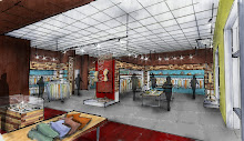
 perspective of back of retail store highlighting the mid-floor fixtures and designer wall.
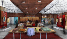
 this perspective shows the front of the store along with the men's section and mid-floor display fixtures. the use of color and display sets already begin to create an updated image for existing salvation army family stores.
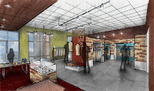
the second scheme steered away from scheme 1 in the fact that we proposed taking out half of the wall that separates the two spaces and placing the retail floor along the entire store front. that leaves the donation center/ drop off in the back of the store and aids in the direction of donation traffic away from the store fronts. we have also proposed a few sets of dividing walls to be placed on the sales floor to break up the current displays of 'rows + rows of racks.' the walls begin to designate more intimate spaces to create a personal shopping experience for customers. through the design of the dividing walls- opportunities are created to highlight certain merchandise along these walls in a display set with mannequins and accessories.

 this perspective shows one of the dividing walls that delineates space within the sales floor. the walls creates a platform for a display of seasonal merchandise to be placed in the front of the store to greet customers as they enter.

on friday- june 5th we had our first design review with salvation army's new store committee to present our initial design ideas for the retail store/ donation center. we presented to them first our precedents and research on spatial requirements based on codes and proxemics. below is a list of the spaces that will be included in the design and it's appropriate square footage.
 this graph begins to show how much space will be allocated just towards specific amenities within the space- such as circulation and structure.
we took the research gathered for the program and designed two schemes to propose to salvation army. along with an adjacency diagram- we constructed a pro + con list of each scheme to explain the reasons for each scenario.
the first scheme followed their initial ideas of having the donation center in the long narrow leasing space and the retail floor in the larger space. we proposed on expanding the back storage room into the larger area and decreasing the retail floor. we sectioned off the retail floor to accommodate men's, women's, children's and seasonal apparel.

 perspective of back of retail store highlighting the mid-floor fixtures and designer wall.this perspective shows the front of the store along with the men's section and mid-floor display fixtures. the use of color and display sets already begin to create an updated image for existing salvation army family stores.
the second scheme steered away from scheme 1 in the fact that we proposed taking out half of the wall that separates the two spaces and placing the retail floor along the entire store front. that leaves the donation center/ drop off in the back of the store and aids in the direction of donation traffic away from the store fronts. we have also proposed a few sets of dividing walls to be placed on the sales floor to break up the current displays of 'rows + rows of racks.' the walls begin to designate more intimate spaces to create a personal shopping experience for customers. through the design of the dividing walls- opportunities are created to highlight certain merchandise along these walls in a display set with mannequins and accessories.

 this perspective shows one of the dividing walls that delineates space within the sales floor. the walls creates a platform for a display of seasonal merchandise to be placed in the front of the store to greet customers as they enter.
one aspect of our proposed design that steps beyond the current displays in salvation army stores are window displays. we have proposed that within each window- there would be a grouping of mannequins to display the current seasonal merchandise. dramatic lighting and graphics will add in the backdrop to the merchandise as well as enforce the brand of salvation army. a wooden cut out of the classic salvation army shield would be hung from the ceiling to frame their motto of 'doing the most good.'
OUTCOME:
throughout our presentation- we tried to enforce the reasons as to why we felt scheme 2 would be a more successful option for salvation army- specifically in the long run. to our delight- the members of the store committee all agreed with us in stating that scheme 2 was the best option. their only concern was- of course- how much more the construction process would be to make the supplemental changes. to determine the prices for construction- we will need to be meeting with the contractor on the project as well as the leasing agent of the property to make sure the structural changes we are proposing will not impact future renovations for tenants.
the important qualities that they understood is that we are looking to invest into a design that will be a successful and holistic shopping experience that will allow room for growth and possible expansion in the future.
the important qualities that they understood is that we are looking to invest into a design that will be a successful and holistic shopping experience that will allow room for growth and possible expansion in the future.
Thursday, June 4, 2009
a peeping 'fish'...who would of thought.
i've been on the search for a couple days now for the right precedent photos that begin to express specific qualities of a typical 'boutique.' these qualities include window displays, vignette displays, dressing rooms, lighting, materiality, and the cash rap.

 interior images of the new eco-friendly timberland store in new york. second hand items [such as suitcases] act as a platform for their show display. it proves that when 'second hand' items are taken out of a certain context- they truly can transform into a beautiful display piece.

 this little second hand boutique in england successfully displays their second hand clothes by simply hanging them on nice wooden hangers. they installed a wooden shelf above the racks to display other accessories such as shoes and purses. this collage of visual merchandising is something we thought would be successful in salvation army.

 the dressing room area is another space within the store that has great opportunity to continue the new 'boutique' image and applied graphics. i love the graphics applied in the dressing rooms of free people. yes-- it is very 'girlie' but the graphics are wonderful and they used fabric as a simple solution for doors that continue to extend their brand onto a smaller and more intimate level.
 ......and i just thought this was fun-- a peeping 'fish' on the walls of the dressing rooms in a boutique in chicago!

 interior images of the new eco-friendly timberland store in new york. second hand items [such as suitcases] act as a platform for their show display. it proves that when 'second hand' items are taken out of a certain context- they truly can transform into a beautiful display piece.
 this little second hand boutique in england successfully displays their second hand clothes by simply hanging them on nice wooden hangers. they installed a wooden shelf above the racks to display other accessories such as shoes and purses. this collage of visual merchandising is something we thought would be successful in salvation army.
 the dressing room area is another space within the store that has great opportunity to continue the new 'boutique' image and applied graphics. i love the graphics applied in the dressing rooms of free people. yes-- it is very 'girlie' but the graphics are wonderful and they used fabric as a simple solution for doors that continue to extend their brand onto a smaller and more intimate level.
 ......and i just thought this was fun-- a peeping 'fish' on the walls of the dressing rooms in a boutique in chicago!
Wednesday, June 3, 2009
making used cool
 Given our conversation yesterday with Anna, I was happy to discover TINI (This is Not Ikea). Check out the About page and scroll down to see how they answer the question of "why do people buy our pieces?" and how they justify vintage as the ultimate green.
[discovered via Please Sir]
meeting with scott.
matt and i traveled over to revolution mills today to meet with scott richardson- a lighting designer for LIGHT DEFINES FORM. we were able to sit down with him for about an hour to explain our project to him and receive some feedback and advice on how we should approach the lighting conditions within this retail space.
he first discussed with us some rules of thumb regarding 2D and 3D focal lighting:
-2D [graphics applied to the wall or flat vertical surfaces]:: position the light source 30 degrees from the surface to be accented.
-3D [mannequin set ups/ mid-floor fixtures]:: position the light source on a 45 degree angle from all sides of the display. he suggested using spot lights as well as flood lights within a track system to equal out the amount of shadow on the display and receive the maximum amount of illumination.
we also had a discussion about the window display and how lighting plays a key role in the success of the display. the challenge with this specific location is that there is a large amount of glare along the windows due to the fact that the windows are facing the west side and the building has a large overhang. he suggested we have track lighting that lights the backdrop/ background and also place two track lights vertically along both sides of the window to accent and balance the light on the actual mannequin displays.
he was also able to give us some lighting companies to look into that were reasonablly priced because he understood that we have a tight budget and we need to be conceienous of the amount of money we spend.
Subscribe to:
Posts (Atom)